Amazon SES (for Amazon Simple Email Service) is the cloud-based email sending service by AWS.
Laravel allows the use of Amazon SES through the Amazon AWS SDK for PHP.
I did not find a lot of documentation and tutorials when I first installed Amazon SES on a Laravel for a client.
Here is a quick tutorial to integrate SES in 5 minutes top chrono!
1 — Create an AWS Account (if you do not have one yet)
It is happening here: https://portal.aws.amazon.com/billing/signup#/start
2 — Add a new domain
The links of this tutorial are for the region eu-west-1, you can use the region you want.
Go here: https://eu-west-1.console.aws.amazon.com/ses/home?region=eu-west-1/verified-senders-domain
and click on Verify a New Domain:

Add a new domain
Indicate your domain and tick Generate DKIM Settings.
To complete verification of your domain, you must add TXT record to the domain’s DNS settings.
There is normally:
- 1 TXT field
- 3 CNAME fields
- 1 MX field
Find this information in the provider’s DNS settings of your domain.
Once done, you will receive an email telling you that your domain has been validated and its “Verification Status” will change to “verified”.
3 — Add an email address
Add the email address you would like to use to send emails here: https://eu-west-1.console.aws.amazon.com/ses/home?region=eu-west-1#verified-senders-email:
You will receive a confirmation email with a link to click to confirm that the email address belongs to you.
4 — Create an IAM user and API keys
To avoid using the API keys of your main account (which has far too permissive rights) we will create an IAM user who will have rights only for Amazon SES.
Go here : https://console.aws.amazon.com/iam/home?region=eu-west-1#/users
Click on “Add user”.

Add IAM user
Enter a name for your user, eg “domain_SES” and tick “Programmatic access”.
Click on “Next”.
On the next screen click on “Attach existing policies directly” and search for the “AmazonSESFullAccess” policy:

Search the AmazonSESFullAccess policy
Tick the line and click “Next”.
Click again “Next” (you can add tags if you want) and then click “Create User”.
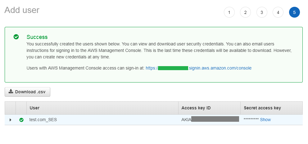
Important: note the Access key ID and the Secret access key (click show to display the secret key).
5 — Configure the Laravel
Let’s start by installing the AWS SDK for PHP:
composer require aws/aws-sdk-php
In config/services.php,
'ses' => [
    'key' => env('SES_KEY'),
    'secret' => env('SES_KEY_SECRET'),
    'region' => env('SES_REGION'),
],
In your .env file :
SES_KEY=key_from_AWS
SES_KEY_SECRET=secret_key_from_AWS
SES_REGION=region_from_AWS
In my case the region is eu-west-1.
Run php artisan cache:clear to take into account the changes.
6 — Test of an email sending
Let’s generate a Laravel Mailable :
php artisan make:mail TestAmazonSes
You should have a app/Mails/TestAmazonSes.php file now.
Add this content to it:
<?php

namespace App\Mail;
use App\Models\Customer;
use Illuminate\Bus\Queueable;
use Illuminate\Mail\Mailable;
use Illuminate\Queue\SerializesModels;
use Illuminate\Contracts\Queue\ShouldQueue;

class TestAmazonSes extends Mailable
{
    use Queueable, SerializesModels;

    public $email_content;

    /**
     * Create a new message instance.
     *
     * @return void
     */
    public function __construct($email_content)
    {
        $this->email_content = $email_content;
    }
    /**
     * Build the message.
     *
     * @return $this
     */
    public function build()
    {
        return $this->from('address_added_on_aws')->view('emails.tpl');
    }
}
TestAmazonSes.php
as you can see with ->view('emais.tpl') it uses a view.
Let’s create this view in resources/views/emails/tpl.blade.php :
Here is a basic responsive template insipired from https://github.com/leemunroe/responsive-html-email-template for our test (you can use the template you want):
<!doctype html>
<html>
<head>
<meta name="viewport" content="width=device-width" />
<meta http-equiv="Content-Type" content="text/html; charset=UTF-8" />
<title>Simple Transactional Email</title>
<style>
/* -------------------------------------
GLOBAL RESETS
------------------------------------- */
/*All the styling goes here*/
img {
border: none;
-ms-interpolation-mode: bicubic;
max-width: 100%;
}
body {
background-color: #f6f6f6;
font-family: sans-serif;
-webkit-font-smoothing: antialiased;
font-size: 14px;
line-height: 1.4;
margin: 0;
padding: 0;
-ms-text-size-adjust: 100%;
-webkit-text-size-adjust: 100%;
}
table {
border-collapse: separate;
mso-table-lspace: 0pt;
mso-table-rspace: 0pt;
width: 100%; }
table td {
font-family: sans-serif;
font-size: 14px;
vertical-align: top;
}
/* -------------------------------------
BODY & CONTAINER
------------------------------------- */
.body {
background-color: #f6f6f6;
width: 100%;
}
/* Set a max-width, and make it display as block so it will automatically stretch to that width, but will also shrink down on a phone or something */
.container {
display: block;
margin: 0 auto !important;
/* makes it centered */
max-width: 580px;
padding: 10px;
width: 580px;
}
/* This should also be a block element, so that it will fill 100% of the .container */
.content {
box-sizing: border-box;
display: block;
margin: 0 auto;
max-width: 580px;
padding: 10px;
}
/* -------------------------------------
HEADER, FOOTER, MAIN
------------------------------------- */
.main {
background: #ffffff;
border-radius: 3px;
width: 100%;
}
.wrapper {
box-sizing: border-box;
padding: 20px;
}
.content-block {
padding-bottom: 10px;
padding-top: 10px;
}
.footer {
clear: both;
margin-top: 10px;
text-align: center;
width: 100%;
}
.footer td,
.footer p,
.footer span,
.footer a {
color: #999999;
font-size: 12px;
text-align: center;
}
/* -------------------------------------
TYPOGRAPHY
------------------------------------- */
h1,
h2,
h3,
h4 {
color: #000000;
font-family: sans-serif;
font-weight: 400;
line-height: 1.4;
margin: 0;
margin-bottom: 30px;
}
h1 {
font-size: 35px;
font-weight: 300;
text-align: center;
text-transform: capitalize;
}
p,
ul,
ol {
font-family: sans-serif;
font-size: 14px;
font-weight: normal;
margin: 0;
margin-bottom: 15px;
}
p li,
ul li,
ol li {
list-style-position: inside;
margin-left: 5px;
}
a {
color: #3498db;
text-decoration: underline;
}
/* -------------------------------------
BUTTONS
------------------------------------- */
.btn {
box-sizing: border-box;
width: 100%; }
.btn > tbody > tr > td {
padding-bottom: 15px; }
.btn table {
width: auto;
}
.btn table td {
background-color: #ffffff;
border-radius: 5px;
text-align: center;
}
.btn a {
background-color: #ffffff;
border: solid 1px #3498db;
border-radius: 5px;
box-sizing: border-box;
color: #3498db;
cursor: pointer;
display: inline-block;
font-size: 14px;
font-weight: bold;
margin: 0;
padding: 12px 25px;
text-decoration: none;
text-transform: capitalize;
}
.btn-primary table td {
background-color: #3498db;
}
.btn-primary a {
background-color: #3498db;
border-color: #3498db;
color: #ffffff;
}
/* -------------------------------------
OTHER STYLES THAT MIGHT BE USEFUL
------------------------------------- */
.last {
margin-bottom: 0;
}
.first {
margin-top: 0;
}
.align-center {
text-align: center;
}
.align-right {
text-align: right;
}
.align-left {
text-align: left;
}
.clear {
clear: both;
}
.mt0 {
margin-top: 0;
}
.mb0 {
margin-bottom: 0;
}
.preheader {
color: transparent;
display: none;
height: 0;
max-height: 0;
max-width: 0;
opacity: 0;
overflow: hidden;
mso-hide: all;
visibility: hidden;
width: 0;
}
.powered-by a {
text-decoration: none;
}
hr {
border: 0;
border-bottom: 1px solid #f6f6f6;
margin: 20px 0;
}
/* -------------------------------------
RESPONSIVE AND MOBILE FRIENDLY STYLES
------------------------------------- */
@media only screen and (max-width: 620px) {
table[class=body] h1 {
font-size: 28px !important;
margin-bottom: 10px !important;
}
table[class=body] p,
table[class=body] ul,
table[class=body] ol,
table[class=body] td,
table[class=body] span,
table[class=body] a {
font-size: 16px !important;
}
table[class=body] .wrapper,
table[class=body] .article {
padding: 10px !important;
}
table[class=body] .content {
padding: 0 !important;
}
table[class=body] .container {
padding: 0 !important;
width: 100% !important;
}
table[class=body] .main {
border-left-width: 0 !important;
border-radius: 0 !important;
border-right-width: 0 !important;
}
table[class=body] .btn table {
width: 100% !important;
}
table[class=body] .btn a {
width: 100% !important;
}
table[class=body] .img-responsive {
height: auto !important;
max-width: 100% !important;
width: auto !important;
}
}
/* -------------------------------------
PRESERVE THESE STYLES IN THE HEAD
------------------------------------- */
@media all {
.ExternalClass {
width: 100%;
}
.ExternalClass,
.ExternalClass p,
.ExternalClass span,
.ExternalClass font,
.ExternalClass td,
.ExternalClass div {
line-height: 100%;
}
.apple-link a {
color: inherit !important;
font-family: inherit !important;
font-size: inherit !important;
font-weight: inherit !important;
line-height: inherit !important;
text-decoration: none !important;
}
.btn-primary table td:hover {
background-color: #34495e !important;
}
.btn-primary a:hover {
background-color: #34495e !important;
border-color: #34495e !important;
}
}
</style>
</head>
<body class="">
<span class="preheader">This is preheader text. Some clients will show this text as a preview.</span>
<table role="presentation" border="0" cellpadding="0" cellspacing="0" class="body">
<tr>
<td> </td>
<td class="container">
<div class="content">
<!-- START CENTERED WHITE CONTAINER -->
<table role="presentation" class="main">
<!-- START MAIN CONTENT AREA -->
<tr>
<td class="wrapper">
<table role="presentation" border="0" cellpadding="0" cellspacing="0">
<tr>
<td>
<p>Hi there,</p>
<p>{{ $content }}</p>
</td>
</tr>
</table>
</td>
</tr>
<!-- END MAIN CONTENT AREA -->
</table>
<!-- END CENTERED WHITE CONTAINER -->
<!-- START FOOTER -->
<div class="footer">
<table role="presentation" border="0" cellpadding="0" cellspacing="0">
<tr>
<td class="content-block">
<span class="apple-link">Company Inc, 3 Abbey Road, San Francisco CA 94102</span>
<br> Don't like these emails? <a href="http://i.imgur.com/CScmqnj.gif">Unsubscribe</a>.
</td>
</tr>
<tr>
<td class="content-block powered-by">
Powered by <a href="http://htmlemail.io">HTMLemail</a>.
</td>
</tr>
</table>
</div>
<!-- END FOOTER -->
</div>
</td>
<td> </td>
</tr>
</table>
</body>
</html>
tpl.blade.php
Now we juste have to send the email where we want. I will create a route /test to test that everything works well.
In web/routes.php add :
Route::get('test', function () {
      Mail::to('email@doe.com)->send(new TestAmazonSes('It works!'));
});
You should receive the email on the indicated address 🙂